Investors do not fund beautiful decks, they fund clarity, credibility, and momentum. Your pitch slides convert when they make it effortless for a busy investor to grasp the insight, believe the proof, and want the next meeting. Below is a practical playbook, grounded in what investors actually look for, on designing and telling a story that turns a skim into a yes.
What “conversion” means for pitch slides
Conversion is not a term sheet on slide 15. In most cases it means one of the following:
- Cold outreach, get a first call.
- First call, earn a partner meeting.
- Partner meeting, align on diligence and next steps.
Define your conversion goal before you design. Everything in the deck should ladder to that next step. If you need a refresher on core slide types investors expect, see our overview of what a pitch deck is.
The narrative spine that makes slides convert
Great pitch slides are arranged around a single compelling arc. Use a simple narrative scaffold, then place proof where belief is weakest.
- Problem, who hurts, how often, how expensive. Make the pain concrete.
- Insight, the non-obvious learning that makes your approach different.
- Solution and product, the job you do for the user, shown with a crisp demo.
- Why now, the timing unlock that makes this the moment. See our guide to the Why Now slide.
- Market and motion, who you sell to and how you reach them.
- Traction, hard numbers or quality signals that de-risk the story.
- Business model, how the engine makes money.
- Moat and competition, why you win.
- Team, why you are the team to do it.
- The ask, how much, what for, and the milestones it buys. Deep dive here, how to end a pitch deck.
Tip, Draft this spine in plain text first. If the paragraph reads well out loud in 90 seconds, then design slides to support it.
Design principles that drive action
Investors skim decks in minutes, not hours. Multiple studies of investor behavior show decks are scanned quickly, with more attention going to solution, traction, and business model sections. Keep that in mind as you design.
- One idea per slide, ruthless hierarchy. Your headline should carry the decision, the visual should prove it.
- The 3–30 rule. A slide should make sense in 3 seconds, and hold attention for up to 30 when you speak to it.
- Big type, short copy. Body text 24–28pt for live, 16–20pt for an email deck. Favor short, declarative sentences.
- Contrast is oxygen. Use color and weight to guide eyes to the next proof point. High contrast backgrounds help on projectors and Zoom.
- Show, do not tell. Replace adjectives with charts, product shots, and metrics. Avoid marketing fluff.
- Consistency builds trust. Lock a grid, stick to one or two fonts, and limit your palette.
- Data clarity first. Choose the simplest chart that proves the point. Label axes, include units, and cite sources when relevant.
For deeper visual details, see our guide on how to design a pitch deck.
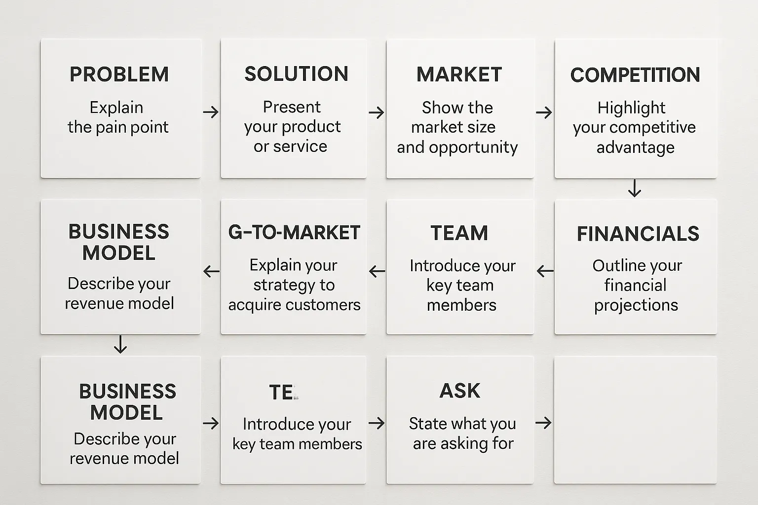
Slide-by-slide, storytelling and design patterns that convert
Below are high-impact tips for common pitch slides. Adapt by stage, pre-seed leans on vision and early signals, seed leans more on traction and repeatability.
Cover
- Story, Your one-line value proposition plus the user you serve.
- Design, Big product or customer outcome image, company name and contact. Avoid taglines that require explaining.
Problem
- Story, Describe the job to be done and the friction today. Anchor with 1–2 stats or a short user vignette.
- Design, Two or three bullets plus an iconographic visual. Keep it scannable.
Insight, “the why we will win”
- Story, The non-obvious learning from research or prior experience that unlocks your approach.
- Design, A single bold statement with a small proof box. This is not a wall of text.
Solution and product
- Story, What the product is, exactly who uses it, and the before or after outcome.
- Design, Large product shot or 3–4 annotated UI callouts. If emailing, include a short animated GIF only if file size stays reasonable.
Why now
- Story, Two to three timing forces, regulatory, technology, behavior, or cost curves, that make now the moment.
- Design, A simple timeline or trend chart with sources. More in our Why Now slide guide.
Market and ICP
- Story, Start with the beachhead ICP, then the expansion path. TAM is less useful than a clear first segment you can dominate.
- Design, Two nested circles or a TAM, SAM, SOM bar with clear assumptions.
Go to market
- Story, How you find, convert, and retain customers. Show repeatable channels and early unit economics.
- Design, Funnel diagram with 3–4 steps, include conversion rates if available.
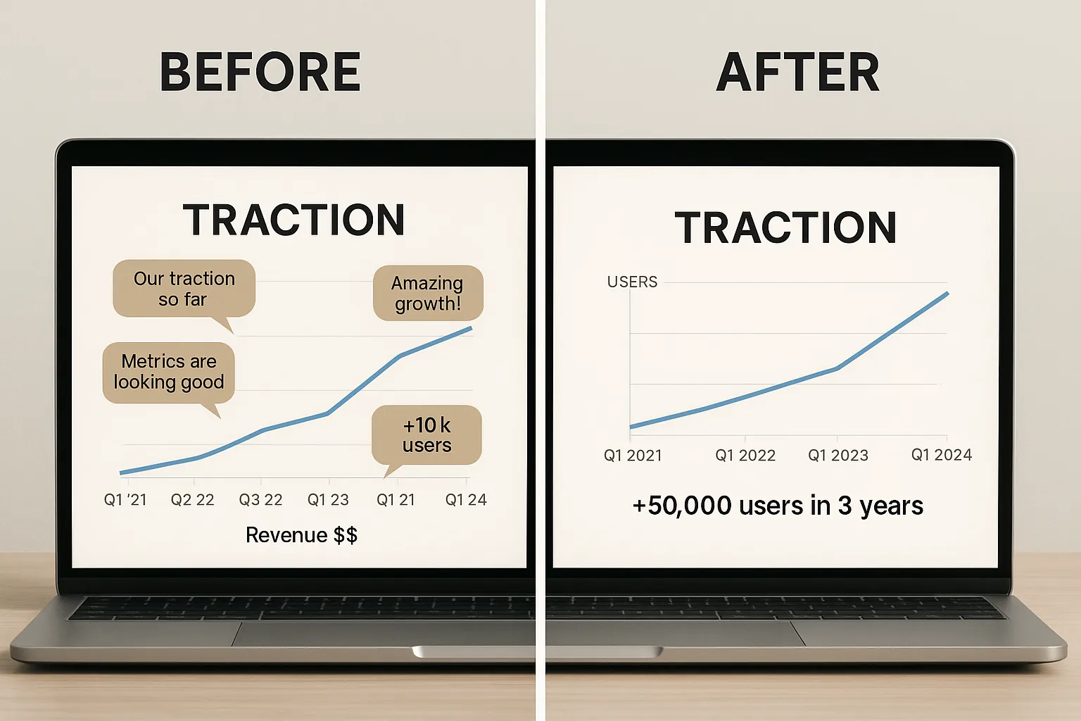
Traction
- Story, Revenue, usage, retention, or quality signals like pilots, LOIs, or active communities. Choose 2–3 metrics that show movement, not vanity.
- Design, One growth chart, ideally cohort or retention if available. Label time frames and milestones.
Business model
- Story, How you make money and what drives expansion. Keep it simple.
- Design, A pricing table or unit economics snapshot with CAC, LTV, gross margin. Round numbers are fine.
Competition and moat
- Story, Your differentiated wedge today and the compounding advantage tomorrow, data, distribution, product, network, or cost.
- Design, Prefer a “customer choice” matrix with buying criteria over a generic 2 by 2 quadrant.
Team
- Story, Why you are the inevitable team, relevant spikes, past wins, and founder market fit.
- Design, Headshots, roles, and one line of proof per person. Avoid long bios.
Financials and roadmap
- Story, Milestones you will hit in the next 18 to 24 months with this round, and what those milestones unlock.
- Design, A milestone timeline with 3–5 markers and a light model snapshot. Keep spreadsheets in the appendix.
The ask
- Story, Amount, use of funds, runway, and the specific de-risking milestones you will achieve.
- Design, One clear number, a three-portion use of funds chart, contact and scheduling link. See how to end a pitch deck.
The conversion table, each slide’s job at a glance
| Slide | Conversion job | Must-have proof | Clean design pattern | Common mistake |
|---|---|---|---|---|
| Cover | Earn a 10 second lean-in | Clear one-liner | Big headline plus product image | Vague tagline |
| Problem | Make the pain undeniable | Specific stat or story | 2–3 bullets with icon | Laundry list of pains |
| Insight | Differentiate your approach | Research or experience | Bold statement plus note | Hand-wavy claims |
| Solution | Show how it works | Annotated UI or demo | Full-bleed product shot | Feature soup |
| Why now | Create urgency | Trend or regulatory shift | Simple trend chart | Hype without sources |
| Market | Prove a real beachhead | ICP definition | TAM, SAM, SOM bars | Inflated TAM |
| GTM | Show repeatability | Early conversion or CAC | 3-step funnel | Channel buzzwords |
| Traction | Build credibility | Revenue, usage, retention | Single growth chart | Vanity metrics |
| Model | Show value capture | Unit economics | Pricing table | Complex math |
| Competition | Show a winnable lane | Buying criteria | Choice matrix | 2 by 2 with you top right |
| Team | Build trust | Relevant spike | Photo, role, one proof | Long bios |
| Ask | Drive next step | Amount and milestones | Number plus pie chart | No clear next step |
Email deck vs live pitch slides
A single deck rarely does both jobs well.
- Email deck, Self-serve, denser copy, 16–20pt body, a few footnotes and links, target 10–15 slides. Keep file under common inbox limits. For context, see our guide on how long a pitch deck should be.
- Live deck, Presentational, sparse copy, 24–28pt body, strong visuals, same story with fewer words. 10–12 core slides plus an appendix.
If you can only maintain one version, ship the email deck and remove text for live talks.
Proving it without revenue, pre-seed tactics
You still need proof, even before revenue. Use credible proxies.
- Demand signals, waitlists, conversion from landing pages, beta lists, community growth.
- Technical validation, prototypes, benchmarks, patents filed, performance versus incumbents.
- Distribution unlocks, signed design partners, channel letters of intent, pilot results.
- Team edge, deep domain expertise or prior company building.
Anchor each claim with a short metric and a logo or quote when allowed.
Writing that lands, microcopy you can reuse
- Problem headline, “X spends Y and still cannot Z.”
- Solution headline, “Do Z in minutes, not months.”
- Traction headline, “Growing 28 percent month over month since August.”
- Why now headline, “Two cost curves just crossed, which makes self-serve viable.”
- Ask headline, “Raising 2.2 million to hit A and B milestones in 18 months.”
Keep headlines plain and specific. The subtext and visuals carry the rest.
Visual checklists for high-converting pitch slides
- Hierarchy, The headline is the largest element, the proof visual is second, any qualifier is third.
- Alignment, Snap to a grid, equal spacing, consistent margins. This builds subconscious trust.
- Color, One accent color for emphasis, otherwise neutral. Color means meaning.
- Charts, No 3D. Label axes, time units, and sources. Keep decimals sane.
- Images, Use real product screenshots or real-world outcomes over stock.
- Accessibility, High contrast and large type help on projectors and mobile.
Process that improves conversion in days, not weeks
- Storyboard first, Write your 10-beat outline in a doc, then sketch thumbnails of each slide.
- Build the spine, Create the 10–12 core slides, move appendix content out of the main flow.
- Run the skim test, Send the PDF to a friendly investor or operator and ask them to read for 3 minutes, then repeat back your story.
- Tighten visuals, Remove one third of the words, enlarge headlines, and clarify charts.
- Rehearse the talk track, Record a 5 minute version and a 12 minute version. Time yourself moving one idea per slide.
- Iterate with data, Track outreach to meeting rate, meeting to partner rate, partner to diligence rate. Change one variable at a time.
For structured help at any step, our templates, expert reviews, and custom design support can remove guesswork.
Credible frameworks worth studying
- Y Combinator’s practical advice on pitching, clear and focused on what investors care about. Read How to pitch your startup.
- Sequoia’s classic outline for investor communication, the essence of what to cover and why. See Writing a Business Plan.
Frequently Asked Questions
How many words per slide is ideal? Aim for 30 to 60 words on self-serve email slides and fewer than 30 in a live deck. Headlines should do most of the work.
Should I include a product demo in the deck? For email decks, a short GIF or a single annotated screenshot is best. For live meetings, show the product inside the slide and offer a separate deep-dive demo if asked.
What if I do not have revenue yet? Use proxies, pilot results, waitlists, letters of intent, early retention, or strong engagement metrics. Tie each proxy to a credible next milestone.
How many pitch slides should I use? Most effective decks fall between 10 and 15 core slides, plus an appendix. The right count depends on stage and format. See our guidance on how long a pitch deck should be.
Do investors prefer numbers or narrative? Both. Lead with a simple narrative so numbers make sense, then prove it with clean charts, cohorts, and unit economics.
Where should I put detailed financials and technical specs? Keep complex models and tech detail in the appendix. Reference them verbally and jump in during Q&A.
Ready to turn your pitch slides into meetings and momentum? Work with Slidesvamp. Use our pitch deck templates to move fast, get an expert review to sharpen your story, or partner with our custom design services to ship an investor-grade deck. Start here, or talk to an expert at Slidesvamp.